Inside the Bayside Pycon Display Home: The Vision and the Finishes
Every home starts with a feeling before it starts with a material. Here's the thinking behind the Bayside display home — the vision that shaped it, and the flat lay of finishes that brought it to life.


The vision: soft toning, and curves used carefully
The starting point for this home was a soft toning feel.
The obvious hero was the curved element sitting right in your line of sight as you enter. Curves are beautiful, but they also date quickly — and that was front of mind from the very beginning. The answer wasn't to avoid them, but to use them deliberately: build a warm palette around them, introduce curves where they earn their place, and make sure the house doesn't depend on carrying that shape through every single room.
The part-arched entry is a good example of that balance. It holds the curve, but pairs it with an angular finish so the detail feels considered rather than committed to a trend.
Individual choices can all be lovely on their own and still not add up to anything. Here, every decision was made against the whole.
That's the case for looking at a house holistically when you're choosing finishes and selections. Individual choices can all be lovely on their own and still not add up to anything. Here, every decision was made against the whole.
Carrying the idea through lighting and furnishings
The same softness runs into the lighting, with curved forms chosen to echo the architecture rather than sit against it.
Furnishings matter just as much. The natural emphasis of the home continues into very textural materials on the furniture, more curved elements, and joinery colours carried consistently through the pieces. Getting that consistency right is what keeps the home reading as one idea instead of a series of separate rooms.

Tiles: one hero, one supporting act
The same tile runs through the main bathroom, ensuite and laundry. It's a genuinely beautiful tile with an enormous amount of variation through it — warmth, neutrals, and even hints of both warm and cool greys in the one piece.
Because there's so much happening in it, it's paired with a plain white tile to take some of the busyness out. That balance lets the feature tile do its work without the rooms feeling loud.
Carpet: neutral, but not flat
Carpet runs through the bedrooms and living areas in a very neutral tone, with a mottled finish that keeps it from reading as plain. It's a small detail that adds something extra and keeps the whole look organic and earthy.
Flooring: seamless throughout
Hard flooring runs through the home in a neutral European oak colour. Carrying one floor through the main living areas of the house creates a seamless look, and it gives every other finish a calm base to sit on.

Paint: bold white trims, colour on the walls
This is where the home makes a deliberate break from recent trends.
For a long time, white-on-white was the default — walls, trims and ceilings all in the same white, everything blending into everything else. That moment has passed. People are coming back around to warm, earthy colour through the house.
So that's the approach here: bold white trims framing rooms that carry real colour. Once there's a colour on the walls, quarter strengths come into play, and the trims still give crisp definition while the walls bring the warmth — which is exactly what the soft toning vision needed.
Metal finishes: brushed brass throughout
Consistency between the metal finishes in the house was a deliberate choice — tapware, internal door handles, the entry door handle and the feature lighting are all brushed brass. It's not uncommon to mix complementary metals, but keeping every metal in the same family here is what makes it feel resolved rather than collected, and the brass lifts the whole home into something a little more elevated.
Joinery and the kitchen
All joinery through the house is done in a warm timber look — polytec Florentine Walnut.
The key decision here was not going matchy-matchy with the floor. Joinery and flooring in the same timber tone can look great in certain spaces, but I wanted to take a different approach for this interior. Instead, the Florentine Walnut was chosen as a complement to the European oak floors while still holding its own presence in the home.
The kitchen itself is deliberately simple: the warm Florentine Walnut paired with a soft-veined off-white stone, complemented with a matching large-format porcelain tile to show an alternative to expensive composite stone. Nothing fighting for attention — just two complementary materials doing their job.
- Feature tile
- Highly varied warm neutral tile — main bathroom, ensuite and laundry
- Supporting tile
- Plain white
- Carpet
- Very neutral tone, mottled finish — bedrooms and living areas
- Hard flooring
- Neutral European oak through the main living areas
- Paint
- Bold white trims with warm, earthy colour on the walls
- Metals
- Brushed brass — tapware, door handles, feature lighting
- Joinery
- polytec Florentine Walnut, warm timber look
- Stone
- Soft-veined off-white, with a matching large-format porcelain tile
The thread running through it all
Warm, neutral, earthy, textural — and consistent from the architecture right through to the furniture. Every finish either supports the one next to it or is given room to be the feature, and the curves appear where they add something rather than everywhere at once.
That restraint is what makes a display home feel liveable rather than staged.
That restraint is what makes a display home feel liveable rather than staged, and it's what will keep this one looking good long after the trend has moved on.
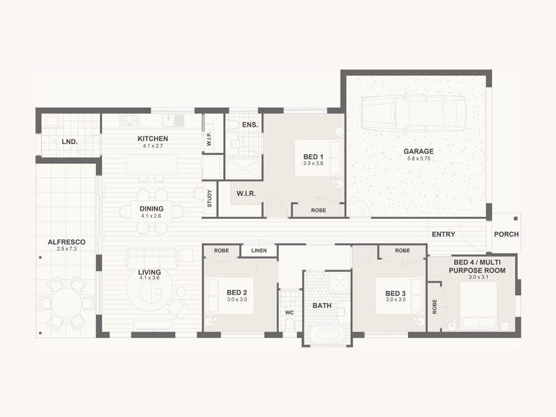
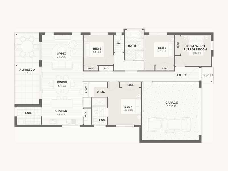
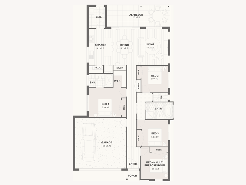
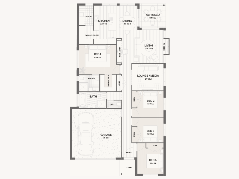
See the Bayside
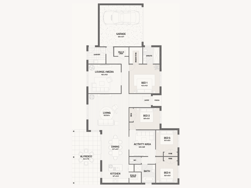
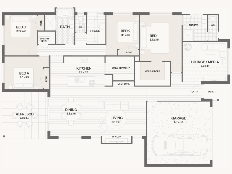
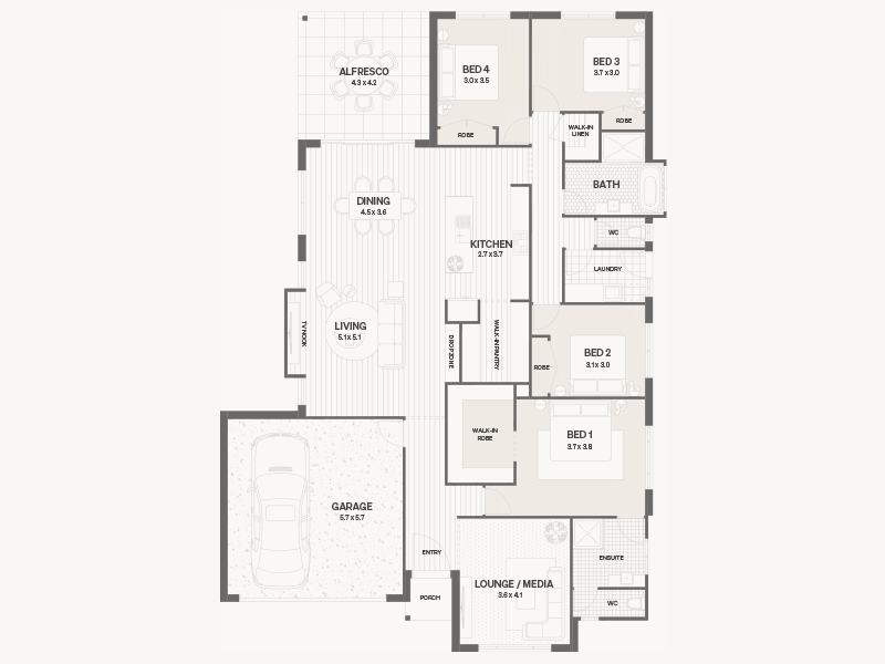
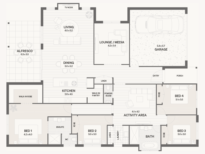
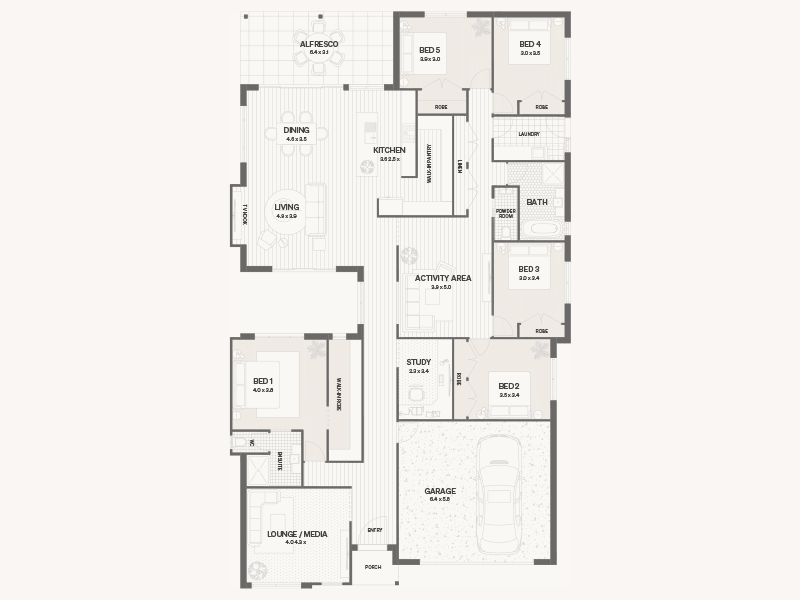
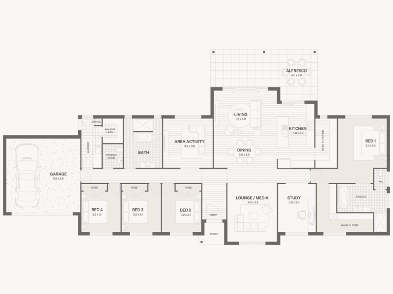
The home behind these finishes. View the Bayside floorplan in 2D and 3D, with room dimensions and facade options.